Project Overview
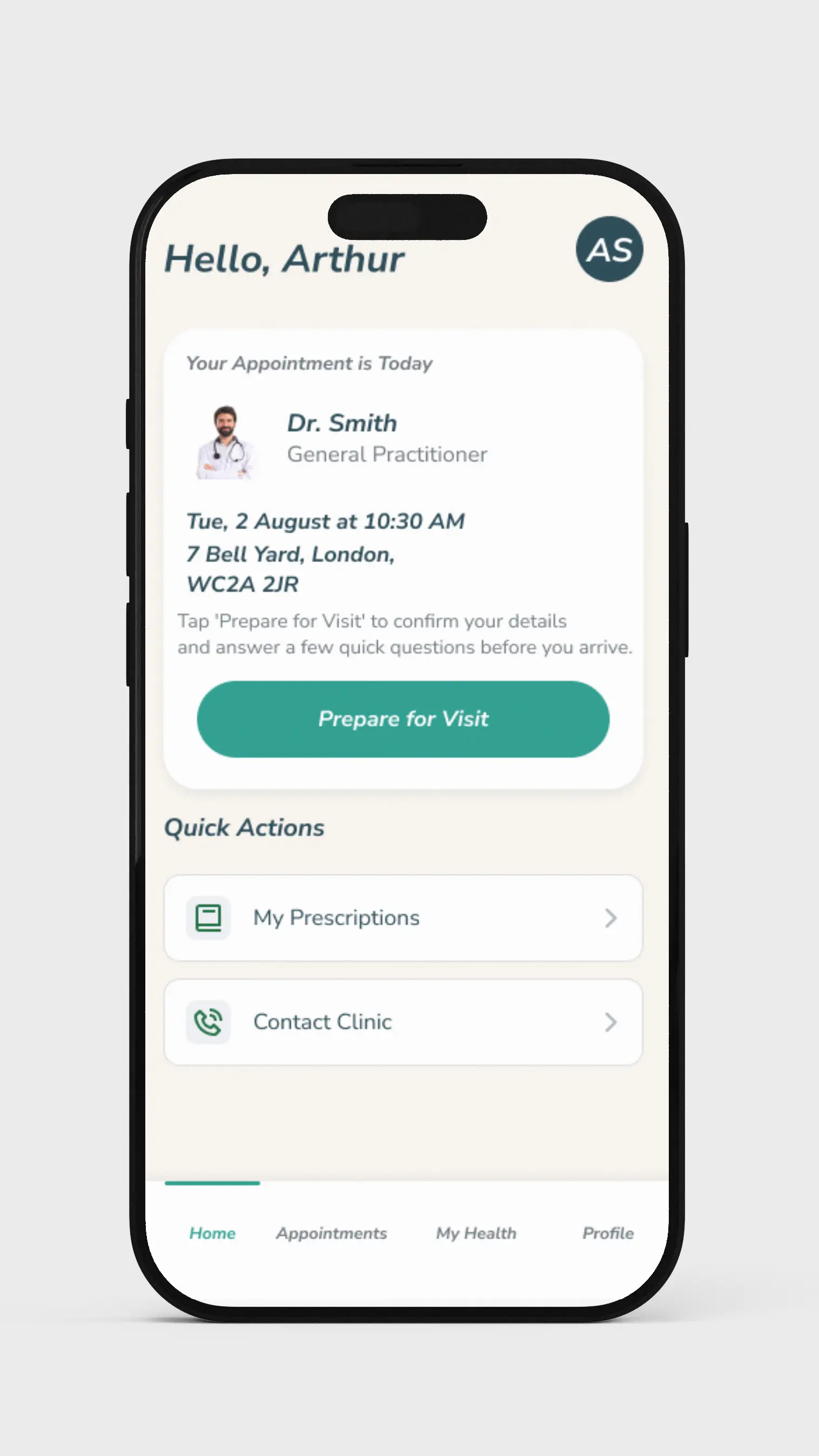
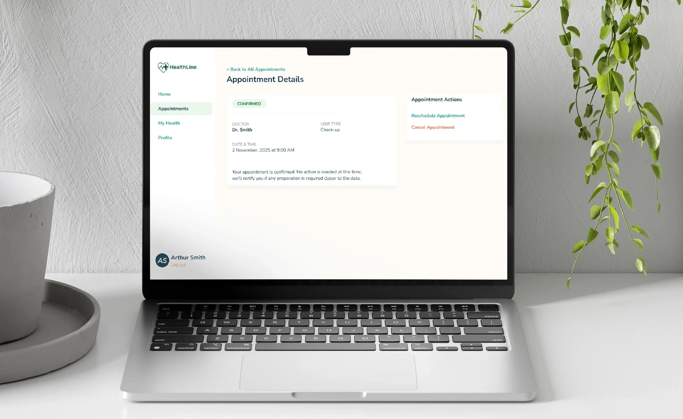
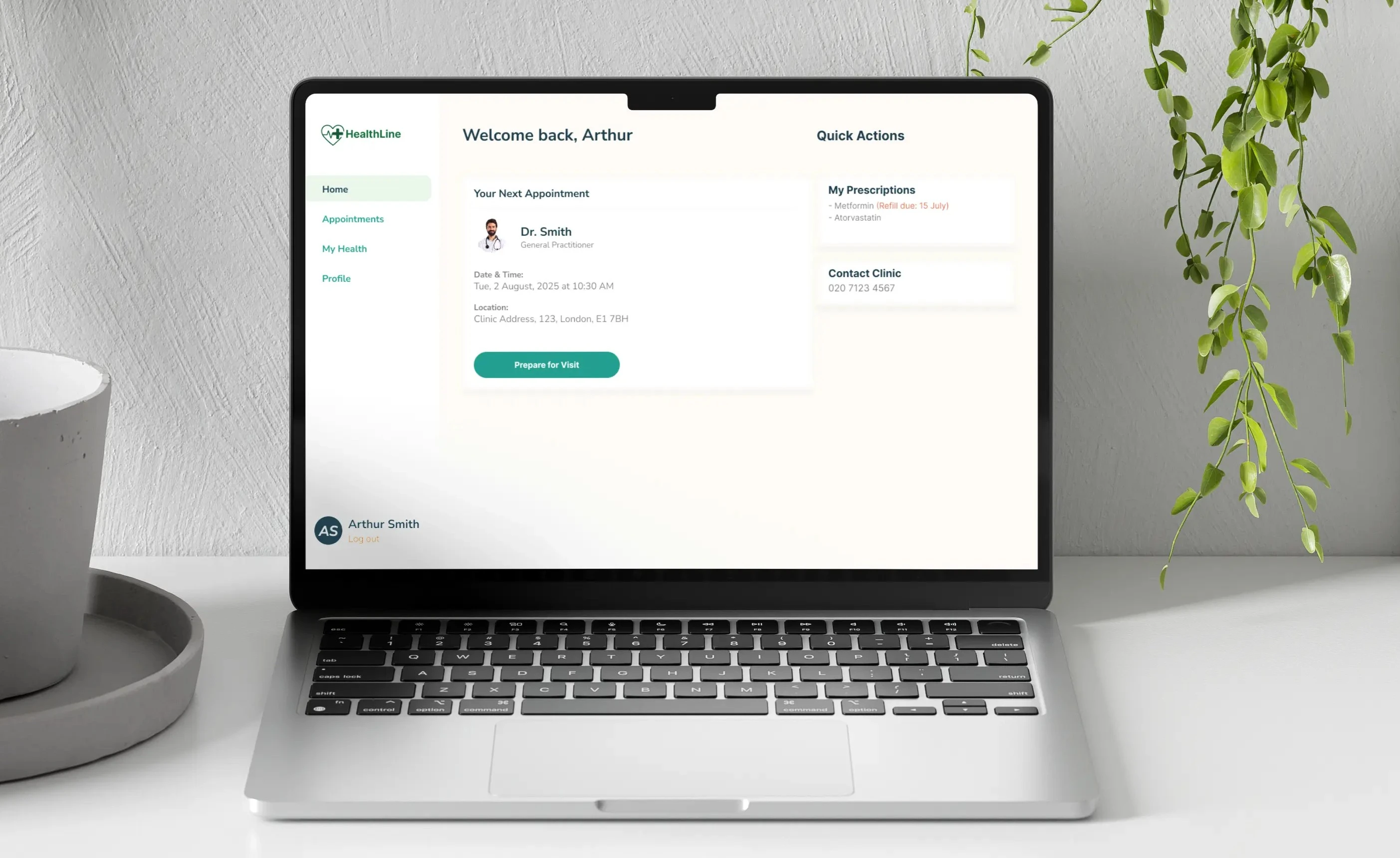
HealthLine is a responsive website and cross-platform mobile app designed to create a stress-free and efficient clinic experience. It empowers patients to handle their appointment logistics digitally—from a guided pre-visit check-in and tailored health screening to viewing their real-time queue status from the comfort of their home.
This case study was developed as a capstone project for the Google UX Design Professional Certificate.
The Problem
Patients, particularly seniors and those with chronic conditions, often face an inefficient and stressful clinic check-in process, leading to anxiety, frustration, and potential health risks in crowded waiting rooms.
Unpredictable Waits
Patients reported waiting up to two hours past their scheduled appointment, causing physical exhaustion and anxiety.
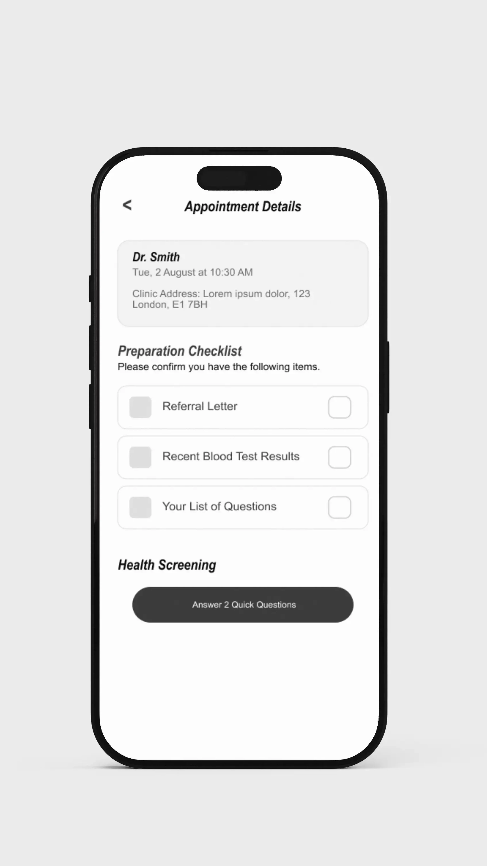
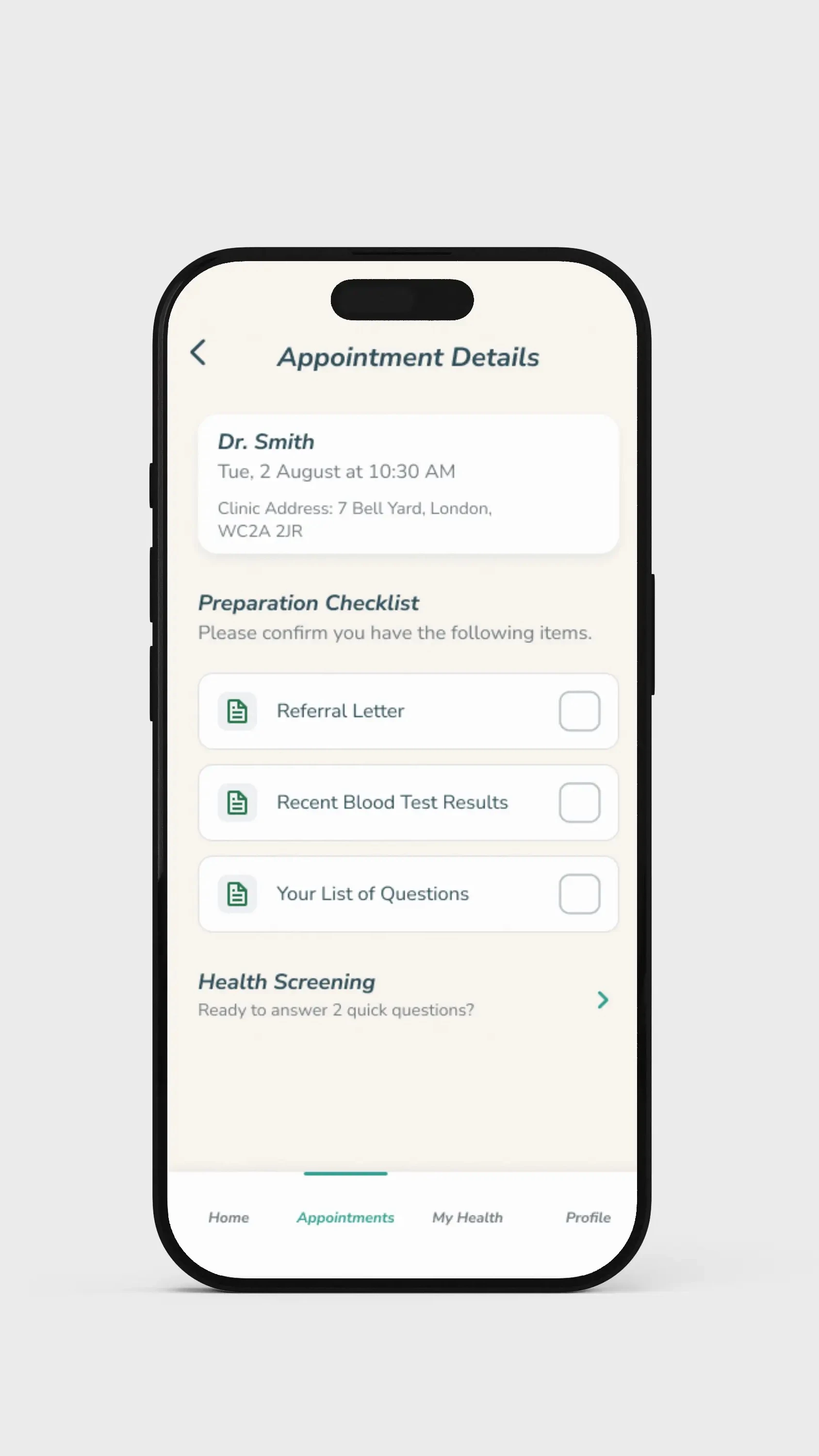
Lack of Preparation
Forgetting essential documents like referral letters was a common frustration, leading to further delays and wasted visits.
Inefficient Processes
The front desk often became a bottleneck as manual check-ins and unprepared patients slowed down the entire queue.
Understanding the User
My initial assumption was that the problem was simply about long queues. However, through in-depth user research, the true pain points emerged: it wasn't just the waiting, but the anxiety of the unknown and the frustration of being unprepared.

Arthur "The Patient" Smith
Problem: Arthur, a 72-year-old retired postman with chronic health conditions, needs a simple, predictable way to manage his clinic appointments because he gets frustrated by inefficient processes, forgetting documents, and unpredictable wait times.
Designing the Solution
The design process was iterative and user-centric, moving from low-fidelity explorations to a polished, tested solution. After usability studies, key refinements were made to enhance clarity and reduce cognitive load.
Before
Two competing calls-to-action created confusion.
After
A clear narrative hierarchy eliminated all user confusion.
Accessibility First
Designing for social good means designing for inclusivity. Accessibility was a core principle of the design process, not an afterthought.
High-Contrast Design
High-contrast colors and large, clear fonts were used to support users with visual impairments.
Large Tap Targets
All interactive elements were designed with large tap targets to accommodate users with reduced motor skills.
Reduced Cognitive Load
Complex tasks were broken down into simple, "one screen, one question" steps to prevent users from feeling overwhelmed.
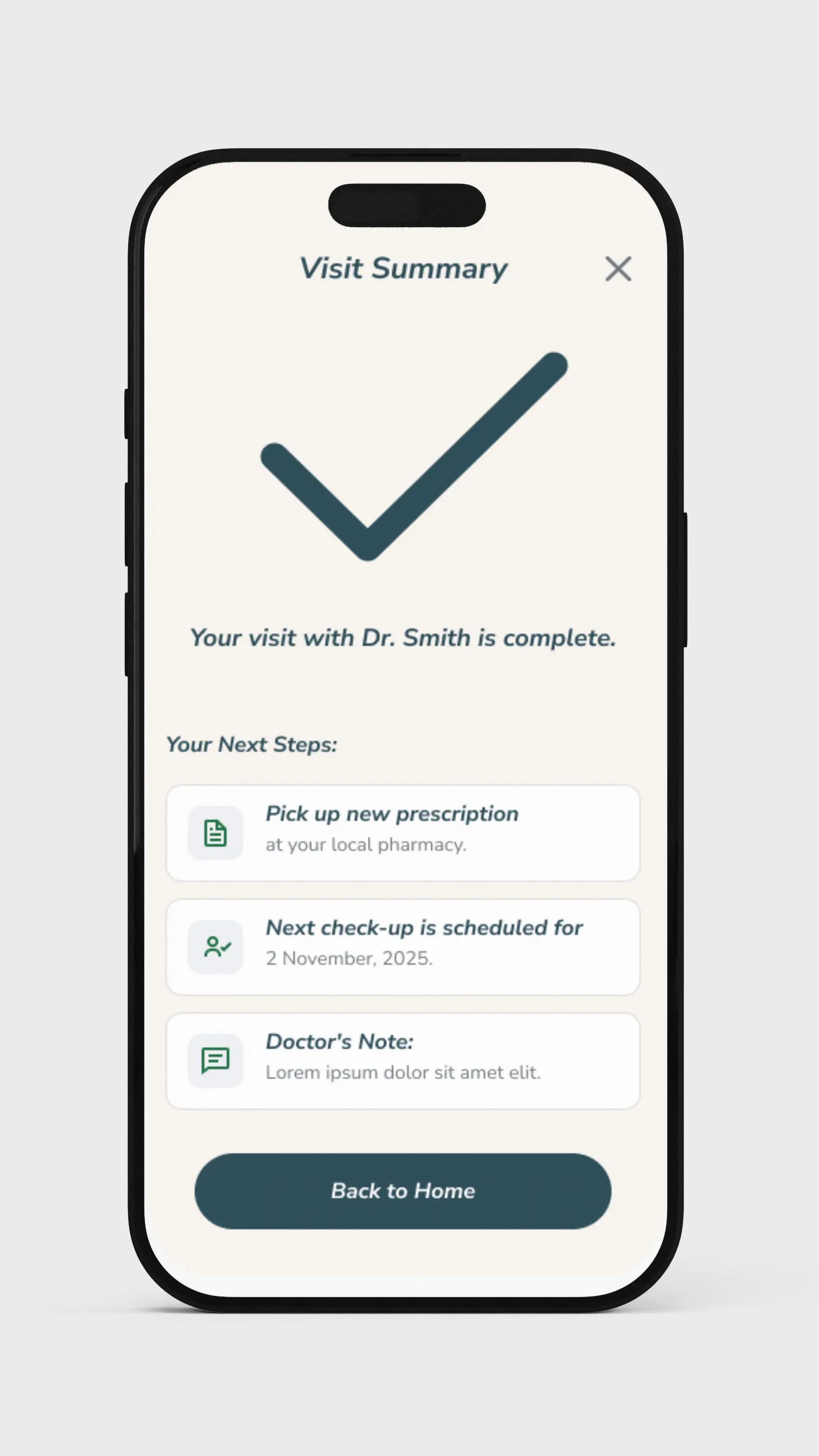
Outcomes & Lessons Learned
"I'm not very good with technology, but this was so simple to use. For the first time, I felt like I was in complete control of my doctor's visit."
Impact
The final design transformed a complex, stressful process into a simple, reassuring digital experience. The solution empowers patients, reduces anxiety, and restores a sense of dignity and control to their healthcare journey.
What I Learned
This project solidified my belief that the most impactful design opportunities are often hidden in plain sight. I learned that deep empathy is the key to uncovering these "invisible" frictions and that our role as designers is to bring simplicity and ease to daily life.