Project Overview
Neon Nexus is a concept for a digital publication focused on the intersection of technology, gaming, and cyberpunk culture. The core challenge was to design a visually immersive platform that feels both futuristic and highly readable.
The design uses a dark, neon-infused aesthetic to draw users into its world, while a clean, card-based layout ensures content is easy to navigate. The result is an engaging and accessible experience for enthusiasts of all things cyberpunk.
The Challenge
The cyberpunk niche is visually saturated. The challenge was to create a brand identity that stands out while ensuring the core function—reading articles—remains comfortable and accessible, avoiding the common pitfall of sacrificing usability for style.
Design System
Typography
Orbitron
Display HeadingAa Bb Cc Dd Ee Ff Gg
The quick brown fox jumps over the lazy dog.
Roboto Mono
Body & UI TextAa Bb Cc Dd Ee Ff Gg
The quick brown fox jumps over the lazy dog.
Color Palette
Void Black
#0D0D1A
The foundational color, representing the deep, immersive darkness of the cyberpunk world. It ensures high contrast and allows the neon accents to shine.
Nexus Pink
#FF00C1
The primary accent for key calls-to-action. This vibrant pink embodies the rebellious and bold spirit of the genre.
Cyber Aqua
#00FFFF
A secondary accent for interactive elements. It provides a cool, technological contrast to the warmth of the pink.
Interface White
#f8f8f8
Used for text and backgrounds. A soft off-white that's easy on the eyes and maintains a clean, modern feel.
Final Design
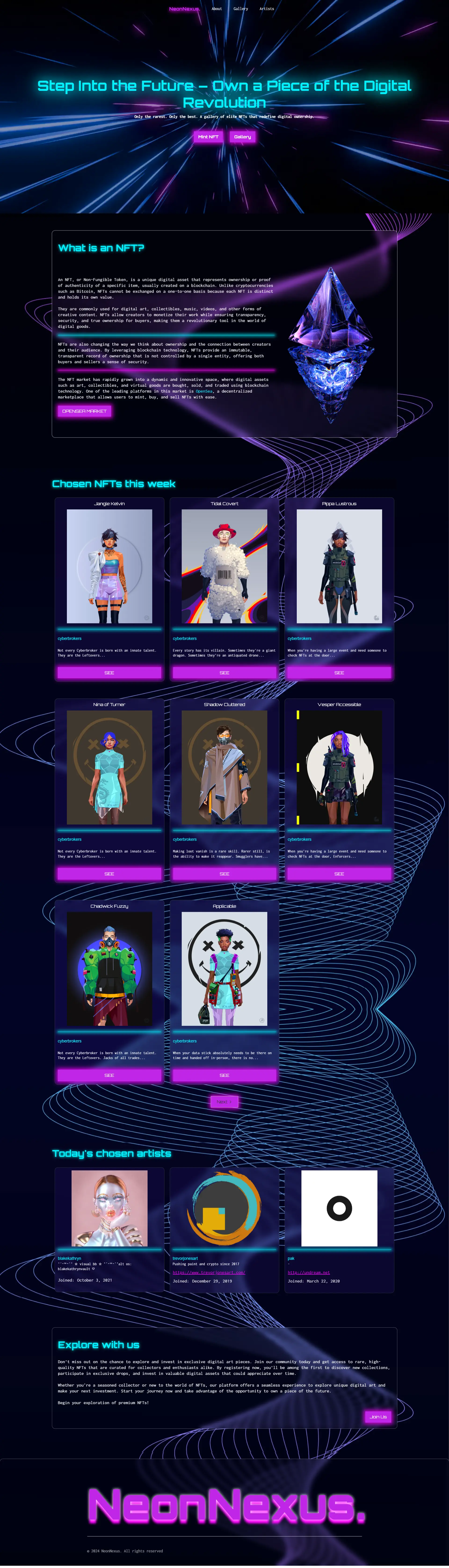
The final landing page design, showcasing the article grid and cyberpunk aesthetic.
Project Impact
By balancing a strong aesthetic with user-centric design principles, the platform is positioned to achieve high engagement and readability.
Higher Engagement (Projected)
Color Contrast Ratio
Responsive Across Devices